AMAZINGGGGGG
By: Maria Popova
How artist Steve Powers made sign painting the voice of the community and the shared narrative of urban life.
Every city needs a love letter. Some are
poetic, some
photographic, some
cartographic, some
illustrated, and some
private. But few come close to the beautiful and heartening typographic murals artist
Stephen Powers has been painting in cities around the world for over a decade, working closely with the local community to give breathtaking visual voice to a neighborhood’s narrative. As a
longtime fan of his work, which I first encountered in the
Brain Pickingsbirthplace of West Philadelphia years ago and which appeared in
Sign Painters, I’m thrilled for the release of
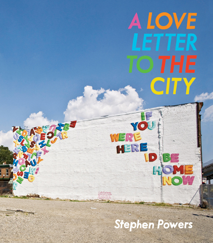
A Love Letter to the City (
public library) — a magnificent monograph from Princeton Architectural Press, in which Powers takes us through the creative process and cultural context of his murals spanning Brooklyn, Syracuse, Coney Island, Philadelphia, Dublin, Belfast, São Paolo, and Johannesburg, based on a combination of Powers’s own ideas and overheard snippets, fragmentary thoughts, and everyday aspirations from members of each local community.
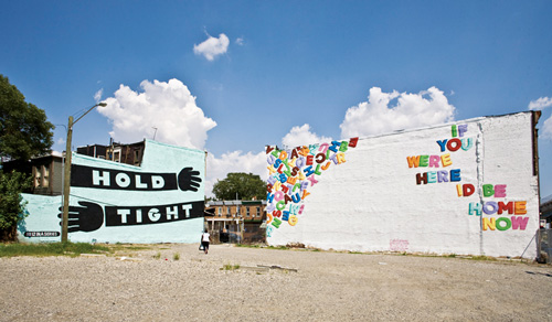
What makes Powers’s work so singular is that it lives at the uncommon intersection of street art and community activism, subverting the conventions of both. It appears where street art ordinarily would, but it isn’t illicitly done under the radar of civic authority — rather, Powers is commissioned by public art organizations or the city itself; it’s the work of a single artist, but he open-sources the creative process to engage the local community in constructing a collaborative point of view.
In the foreword, Peter Eleey, curator of MoMA’s PS1, captures the unusual result beautifully:
His murals humanize the anonymity of urban landscape.
[…]
Powers is a traveling salesman for the social media age, in which the things we can’t find, say, or share online often turn out to be the very goods we need. And so he heads out on foot, knocking on doors, putting up ladders, and rolling out paint. The world’s a big place, but as he would point out, on the road most traveled, there is no reason to ever leave home unless you are making the road better. Look for the man in the yellow raincoat hawking something at the corner of “Above” and “Beyond.”

Steve Powers and his son, Philadelphia
Powers, who came from the world of street art, reflects on how he came into his singular style as he contemplated the challenges of the graffiti genre of urban art in his early twenties:
The problem with graffiti [was that] for all its efforts to communicate, most people don’t understand it, and if people don’t understand, they don’t take ownership.
Aware of this ownership disconnect, Powers found himself longing for a new communication medium that would both honor the traditions of street art and resonate with the community whose walls it graced — walls that would become not barriers but gateways to understanding. He found his answer in Coney Island:
There I found a middle ground between the graffiti I spoke fluently and the painting language I could speak only well enough to order a beer. So I ordered a beer and made paintings that looked like Coney Island signage, except I stripped out the commercial and inlaid emotional content. The resulting art was visually clear and direct, unflinchingly confronting the complexities of love and life in a way I avoided in my everyday living. Coney Island was both sandbox and toolbox, a place where I learned to make effective paintings, perform effective community service, and be an effective carny making cash in the summer sun — all useful skills when it was time to make sign painting the voice of the community, the way Stay High had once made graffiti “The Voice Of The Ghetto.”
At the same time, Powers was noticing that some of Coney Island’s most beautiful hand-painted signs were being replaced by sterile vinyl lettering. So he began offering his services as a sign painter, for free. But even that seemingly simple and altruistic aspiration became a lesson in community context:
In Coney Island, “FREE” means a scam, so I had no takers until Dick Zigun, a mayoral presence in the neighborhood, vouched for me, and I got my first job painting letters on the back of the Eldorado Arcade.
Soon, Powers caught the attention of legendary public arts organization
Creative Time — who were also behind Trevor Paglen’s
The Last Pictures — who offered patronage to transform his grassroots Coney Island work into a full-blown collaborative art project. Together with 40 other artists brought in by Creative Time, Powers and the team painted some sixty signs around the neighborhood.
In 2007, Powers received a Fulbright scholarship, which he used to paint signs and murals in neighborhoods around Dublin and Belfast. Arts programmer Ed Carroll reflects on Powers’s work in Ireland:
Steve’s distinctive practice draws out the narratives of street life, its people and places. You see it in the Fulbright work in Francis Street, Dublin, and Shankill Road, Belfast. Call Me, We Need to Talk, Hope This Finds You Well, and Worth Less are all fragments of exchanges among strangers, yet somehow intimate, too. The Fulbright project conceals a longer story from the creative community bench. This story is a testament to friendship and the time it takes to create a local ecology for a little epiphany of beauty.
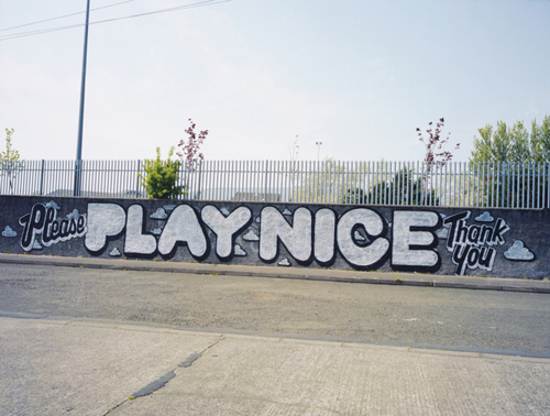
In Ireland, Powers painted one of his murals on a wall facing a row of houses, which he observed for half an hour looking “for any sign of life” as kids from the local school marched by. At last, as a mother peeked out from one of the houses, Powers asked her what he should paint. “Tell them to play nice,” she answered. And so he did:
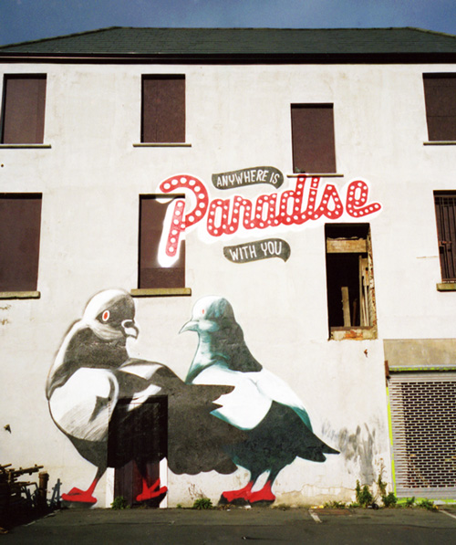
But one of Powers’s most charming signs in Ireland, painted at Dublin’s Tivoli Theater, is a wink to the biological factlet that pigeons mate for life and, as Powers puts it, “make sure they pick a partner they can coo with”:
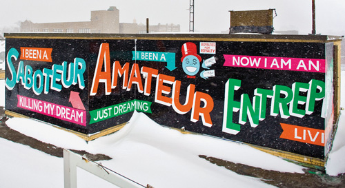
Powers, who had grown up in the rough neighborhood of West Philadelphia himself and returned to the community to paint 25 years later, reflects on working with Jane Golden of the city’s famed Mural Arts Program:
At my first meeting with Mural Arts’ Jane Golden as Pew grantees, I laid out my vision for the look and feel of the project. Jane stopped me and said, “You mean it’s going to be all words? No pictures?” I dug in. “No pictures.” Jane crossed her arms like she was tying her oxfords and, once tight, told me, “You have to sell the idea to the residents of West Philly, one community meeting at a time.” I could feel the fear building in me, but I remained cool and asked, “How many meetings?” We had about nine months before we were to start painting. Jane thought ten meetings would do it. She then assigned me a handler who also had disconnected roots in the community, and together we started planning meetings.
Jane’s methodology is flawless: go into a community, tell people you are going to paint a wall, take suggestions from everybody, work up a sketch, go back to the community, show it to everybody, make changes based on the suggestions, then paint the wall. The art is secondary to bringing the community together and getting everyone to agree on something. The wall stands as testimony to a unified community, even if the artwork is completely boring.
In Syracuse, the project quickly became a testament to the power of process over product, learning ground for improvisation:
A Love Letter to Syracuse is meant to be from Syracuse to Syracuse. We found, as we were painting, that the love letter is also dedicated to industry: to the trains that pass over the bridges, to the act of painting hot steel in the summer, to collaboration, to polite drivers, and, especially, to improvisation. After painting the two West Street bridges, we realized the design I created for one of the sides of the West Fayette Street bridge would be unreadable from most angles and impossible to paint without blocking off traffic completely. So we had to rework it on the spot. We did what any good signwriter would and worked with the architecture of the bridge to make the words fit with grace and ease. The result is different from our original design, but it serves the words and Syracuse well.
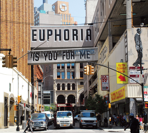
One of my favorite murals is a beautiful long poem, which Powers painted in my neighborhood in Brooklyn:
He contemplates how this particular project, painted around an old Macy’s department store in the facade space between the floors, embodies his general approach:
When I go into a community, I try to find visual cues that are already there and introduce them into the work.
Many consider it an homage to or a riff off Jay Z’s “99 Problems,” but Powers says this wasn’t his intention and adds mischievously:
It’s not, but the thought has crossed my mind about ninety-nine times.
The full text of the poem reads:
YOU TAKE ANY TRAIN
MEET ME DOWNTOWN FOR A FEW EVERY STREET CARRIES US HOME
BORN BUSY AS A BROOKLYN BOUND B I AM MADE TO LEAVE
I AM MADE TO RETURN
HOME
ONWARD UPWARD
I WAS NURTURED HERE I COP FUTURES HERE
LIFE IS A FIGHT FOR LIFE AIDAN SEEGER IS HERE
FROM NINETY-NINE TO NINETY-NINE AND FROM NINE TO NINE
WE COULD SHARE NINETY-NINE STARES ENDURE NINETY-NINE CARES
SAY NINETY-NINE SWEARS
AND BE FINE NINETY-NINE PERCENT OF THE TIME
I AM NINETY-NINE PERCENT SURE THIS LOVE WE SHARE IS 99.9999999999999999999% PURE
I GREW UP IN YOUR ARMS, RAISED TO TAKE FLIGHTS OWNING THE GROUND I HELD STEEPED IN YOUR STORIES
I AM UP WAITING FOR YOU
DOLLAR HERE DOLLAR THERE
HUNDRED HUSTLERS HUSTLE FOR HUNDREDS
SLEEPLESS ENTREPRENEUR TURNS A BUCK INTO FOUR
BARKERS CALL ME TO SHOP AT STORES SOME ARE SELLING ROCKETS
SOME ARE CHECKING POCKETS
SOME ARE ON THE DOCKET
I WALK UP THE BLOCK, MONEY IN SOCK PAST PITFALLS THAT FACE ME
TO BUY CLOTHES AT MACY’S
Dave at The End of Sixth Grade c. 1980
TURN TO ME
I SEE ETERNITY
EUPHORIA
IS YOU FOR ME
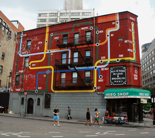
Another Powers gem in my neighborhood, across from The New York Transit Museum, titled Train to Always:
A Love Letter to the City is impossibly moving in its entirety, at once a rare glimpse into the mind of an artist with an uncommon point of a view and gripping testament to the power of art as a common language that brings a community together. Complement it with the bittersweet
Sign Painters, where Powers’s work appears, and with Candy Chang’s
Before I Die, one of the
best art books of 2013, which explores a different facet of the same immutable longing for blending the public and the private in urban space.


 e i
e i ndividual who turns to self-help